At this point, we've established that I have paired React and Next.js with TypeScript to make my website. The next challenge is: How am I going to style it?
I knew from the beginning that I didn't want raw dog the whole thing with plain old CSS. This also meant that I wouldn't be taking advantage of Next.js' built in support for CSS Modules. These days, I think there are more efficient ways to do things.
Blowing in the Tailwind
I really like the approach that Tailwind takes so I knew that I was going to use that. The utility-first approach and the amazing Intellisense in VSCode are right up my alley. However, Tailwind isn't Bootstrap, and for good reason. I started looking for a component library. I was mainly considering ChakraUI until I came across DaisyUI.
A Field Of Daisies
There were a few reasons that I liked DaisyUI. The first reason is that it was built on Tailwind. I can't really think of a practical reason for liking this, but it sorta leads into my second reason for liking DaisyUI: It works the same as Tailwind. Instead of having to import components like one would when using a more mainstream library like Chakra or Material, I can just use a class like btn and then tack on utilities like btn-sm and btn-success to change the appearance of the component. Some might say: Why not use Bootstrap? Frankly, it's my project and I like this solution. I also think that this has the potential to tree-shake and minify better, though I have not researched this. I am also aware that DaisyUI's approach means that I am responsible for the accessibility/ARIA side of things.
Floating Like a Feather (Icon)
and Supercons (but I don't have a pun for that one)
Icons are one of my favorite parts of web design and development. They're often how you signal to users what something does and there's great potential to have fun with it.
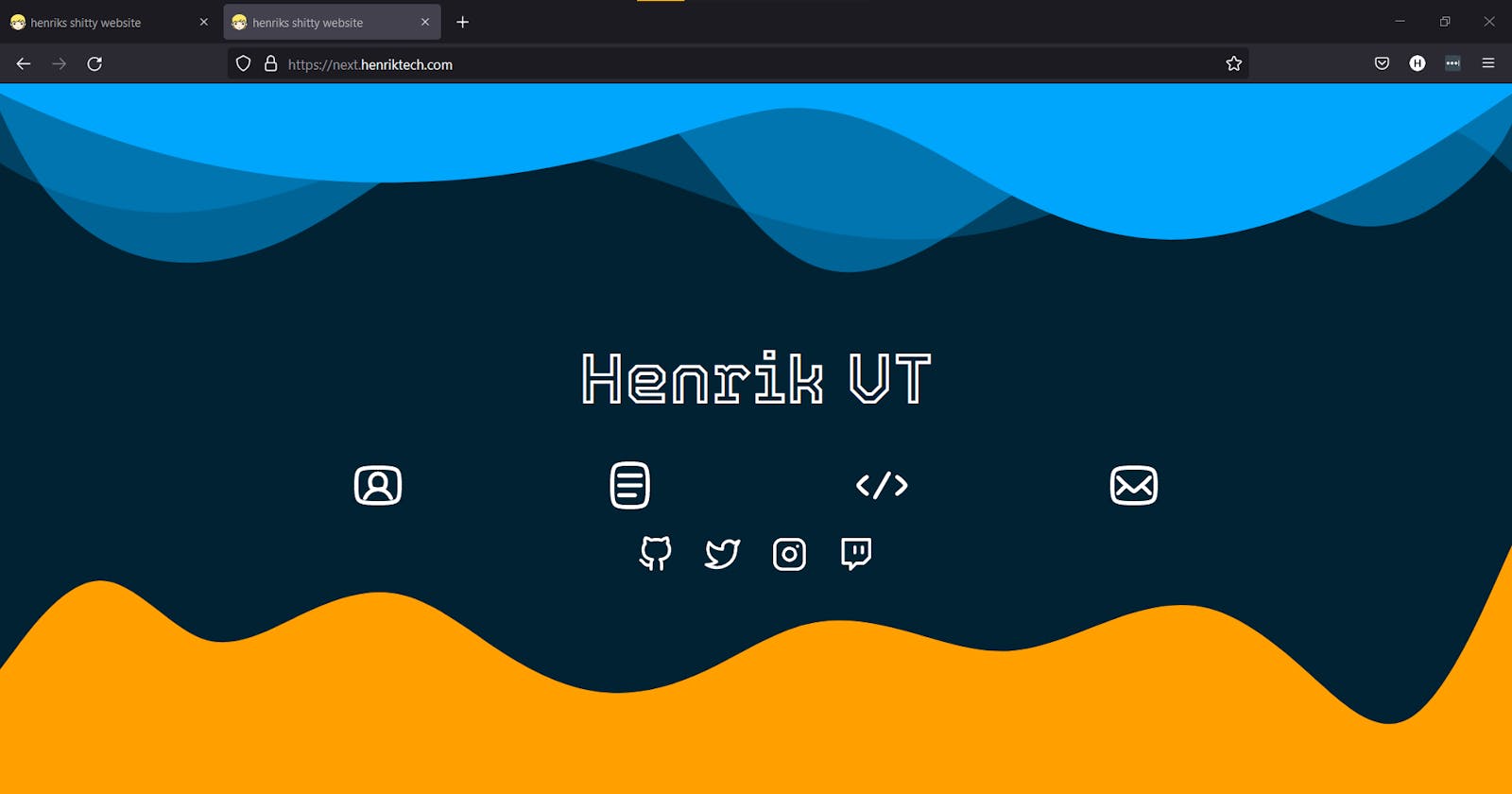
I am using two icon sets for this project: Supercons and Feather Icons (via the react-feather npm package). Supercons is my primary for navigation icons (ie; about page, blog, projects, contact) and Feather Icons for socials (github, twitter, insta, twitch) or to fill in for icons that Supercons doesn't have.
I'm a Developer, not a Designer.
This much is true about me, at least. I know there are plenty of devs out there who love design as much as dev, but that isn't me. I struggled with a design for my website for a long time (and my frustrations with Wordpress' design options pushed me to do web dev) so it took me a while to come up with something that I really liked. Even then, what you see live on next.henriktech.com is not what that was. There are a few steps that I recommend for devs like me:
- Colors! Colors are key. Figure out what your favorite color(s) are and try to generate a palate off of that. I would highly recommend a tool like coolors.co to help you find what you like. For me, I knew I wanted some blue, gray, purple, and orange. I then used Coolors to generate a few shades of each and then put them into my Tailwind config file.
- Typography, aka Fonts. This is another key component of web design. You should find 1-3 fonts that you like. To find these, you can start either on a site like fonts.google.com or find out what font your favorite apps use. If you're really not sure, I recommend the Inter typeface (created by Rasmus Andersson) as a great all-around font for the web. Personally, I chose to make Inter my default font and then I found 3 others that I have locked and loaded. Two of those were found from my favorite app (Discord) and the other one was from Google Fonts.
Now that you have those elements, just try to find designs that you like. You can also use tools like Shape Divider and Hakei. All I can recommend is that you take notes on things you like and just play around with the aforementioned design tools.
Thank you for reading this article!
Stayed tuned for the next few articles in this series coming over the next month or two. Those articles will be focused around how I built specific pages of my site; ie the Blog, Projects, and Contact pages.
:)

